Tuesday, November 25, 2008

MobiBB

It is such a long time from my last post.
Today I come with my new work for my teacher's project: MobiBB (this is such a funny name^^).
Actually, I create an online Blackboard for my university. It contains all information that a student need (except Assignment section^^ ).
Nice Day!!!


Saturday, October 25, 2008

Newest entry!


This is my newest work. Actually, I did it for my friend or my brother (whatever...).
The work is mainly covered by dark yellow. This is my favorite color as i said before. It brings mystery, danger or even sexy. The reason why I say sexy because if you 've ever seen "Sin city" (one of my favorite film), you can understand.
By the way, my girlfriend has just been angry with me. I do not think my word can hurt her like that...just a boring day...hmmm

Sunday, September 21, 2008

Classic.


One way to think.
Sometimes think by myself.
There is a mess in my mind.
But I never realize the way I am going.
In a coffee shop...

Saturday, September 13, 2008

One night with my friends.


One night...
Two friends..
Three dishes...
We got fun.
Sometimes, going out is very good.
Sometimes, new idea is come by nature.

Thursday, September 4, 2008

A hometown trip.

Usually, I spend my holidays in my hometown, so do last one. My hometown is a small town, it is not very beautiful, luxurious even it is simple, poor. But I like it very much, it stores a lot of my memories with my family, my friends, my schools and my girlfriend.
I am not far from my hometown, it tool me 6 hours to come back but I miss it a lot. Every chance when I came back, everything were looked new and curiously.
Last holidays, I also spent at my hometown, I took a lot of images in there from people and scenes.

In a "street coffee shop" with my uncle and others.
A flooded farm
A corner of "street market"
A corner of garden in my house

Chalet typyface

This is the font that I chose for my typographic flash.
I was impressed at the first sight. Accidentally, I found it when I tried to find resources for my last assignment.
Here is some example of this font:


René Albert Chalet was born on April 20, 1923 in Interlaken, Switzeland. His parents affected René in both attitude and interest.
He began his career as a costumes designer in Paris. He achieved some sucesses when he made an effect on the prêt-à-porter clothing market in 1960s and 70s.
He came up with his first font to Deberny & Peignot of Paris in 1944. That font followed by Bahaus style, however it was more modern and valuable when it contained the charming and grotesques of nineteenth century.
However, his font was refused by Deberny & Peignot when they thought this font was associated with "cultural Bolshevists".
Short time later, Max Miedinger created a new typeface which was nearly the same as Chalet's font. Although it was controversial, Miedinger 's font was published by Haas Foundry in Basel, Switzerland, and it was called Neue Haas Grotesk. Not so long later, The Stempel Foundry of Germany paid for Meidinger's font and republished it as the most well-known font all over the world, Helvetica.
The history can not be changed. A remarkable designer was refused his achievement but his contribution was not be able to be forgotten. however, the truth was never hidden and in 2000, House Industries released Chalet type family as recognition talent of forgotten designer - René Albert Chalet.

Sunday, August 24, 2008

DVD cover

This is my DVD cover assignment.
Actually, I satisfied with this one but not to print version because it did not demonstrate exactly as the same to digital version.
In addition, I had lost all of my PSD file before the day I submitted. It's awful but fortunately my lecturer accepted.
Next time, I must be more careful

Saturday, August 16, 2008

Mystery

Another work using blending mode.
Actually, this is my favorite theme: something mystery, something unfolded. And the dark color support this theme very well.
ps.: i've got a bad mark in my assignment, it 's sad. i need to try harder in next time.

Monday, August 11, 2008

A question mark.


Sometimes, I think a lot about the life, which way I should go on, which lifestyle i will apply, which thing I should do to become success. However, behind all of those things is the reality, when I am still a normal guy with nothing.

But I still go on by myself and I need to decide which way I go.

So the main theme of this image is confusing.

Actually, this work came to me when I did my collage assignment, but i didn't use it.
Anyway, thanks if you view my post.^^

Wednesday, July 23, 2008

Wallpaper


I made this wallpaper according to some technique that I 'm very interesting: blending, brush and colorize.
Actually, i read some tuts in the Internet to understand about the blending because I do like this technique (maybe i should write a post about this one in future). This one makes picture become very different and unique. Interesting, right^^
Anyway, feel free to comment. I am very pleased!

Tuesday, July 22, 2008

Sun set photos


Actually, this is my favorite shot.
I like sun, especially sunset.
It makes people feel sad, boring but I feel very comfortable while seeing it.

I made it in Photoshop, inspired from photomontage, maybe in next assignment, i will do something like this one.

Friday, July 11, 2008

Palace of Independence

I think most of you know this place (some of you can go in or some of you just go through ^^). However, I can not disagree that this palace is very great. I leave historical events of this palace because it is history (it 's intelligent if you avoid talking about history as much as you can ^^).
The structure of this palace is really awesome: glamourous, fancy, beautiul, and ...solemn.
Actually, I only want to talk about interior of this palace.
Ngo Viet Thu is the main architecture. He was the one who studied in France and achieved First Grand Prize of Rome in 1955 so he was really influenced from French Art. The reason I really like interior of this palace because it looks like modern style although it was built more than 40 years ago.
These are my favorite views in this palace (all of them in level 2 ^^) and theirs quality can not be good because I only took by my mobile phone.
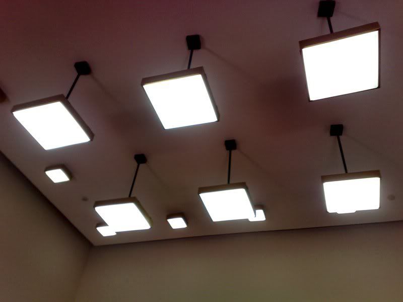
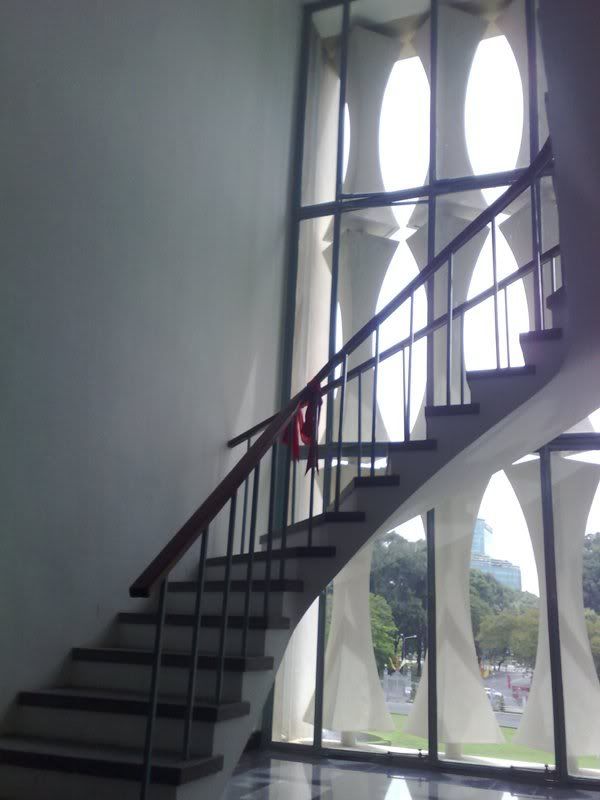
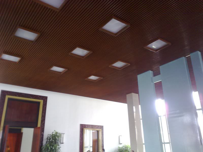
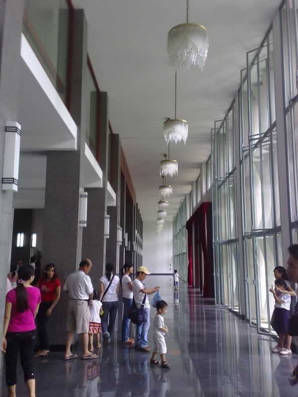
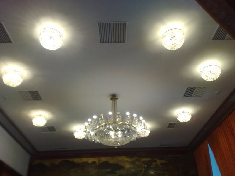
You can see them, the decoration looks like modern house: swirl-stair . flower-lights, etc.
I was impressed by this one:

The reason why i like it is not only its significant, unique but because it also brings the light to every corners of level 2. If you look at theirs design, the way they are sharpened, curved . By that design, the light was bent and light up all the corners. It is interested, isn't it? ^^

That is not all things i want to talk about this palace but I think those things can make you think again about this palace. And if you like, you can express it by yourselves (15000VND/1 person is not cheap with me (^o^) ).

Wednesday, July 9, 2008

Peter Max 's Works


These are 3 works of Peter Max. Actually, it is enough to demonstrate the style of this designer: colorful, coat, oil color.

Thursday, July 3, 2008

Sun and Moon Studio


This is my first post about Sun&Moon Studio.
Actually, when you look at two symbols, you possibly understand two kind of products in this studio: music and film.
Simply, sun and moon can meet together when music and film are mixed together. The multiple lines are the connection. It can demonstrate for smooth and flexible of the studio.
Glad to have your comment!